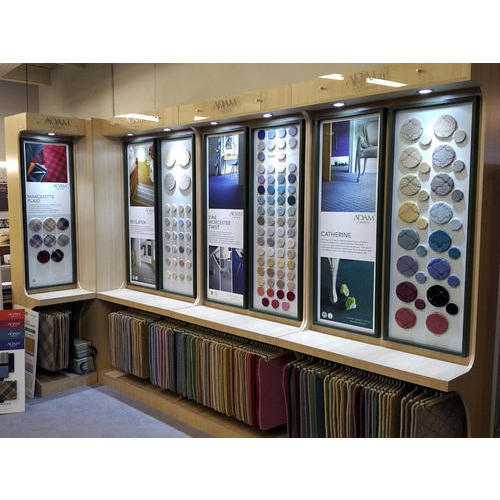
While running brick-and-mortar tile display centers, there are several things to consider regarding the design. A perfect design helps showcase your product perfectly and allows visitors to roam around the showroom with less distraction. Essentially, it helps improve the business’s overall sales and marketing.
So if you are wondering about effective tile showroom design, this article will help you. Here we’ve shared 7 must-have strategies in the design of your tile display showroom.
Table of Contents
Top 7 Strategies in the design of your tile display showroom
The proper execution of the actions below can change the game of your tiles business. Let’s know what they are.
Introduce a circular flow
You shouldn’t waste an inch when it’s about the display. After all, you pay a lot for the space, and the visitors’ first glance matters. They want to see new things whenever they turn a corner or cross.
That’s possible if you make a circle in your outlet. It brings an easy diversity that easily resonates with the visitors’ visions and helps them relate and compare easily. A circular flow suggests multiple designs within seconds. Thus, they feel more inspired to buy more, and instantly.
Apply color story
Going for a presentation without color planning is a mistake. Color gives a clear idea about the space. Therefore, the visitor can explore the atmosphere, and a new view forms in their mind. Each color has integrity and its messages.
Studies say that blue can be both the color of tranquility and sadness. Where green can be a sign of danger or decay. Even a shadow can communicate with the viewers’ emotions and thoughts. So, consider creating a color story with a positive vibe.
Define hot and cold zones
People tend to go to the center first and turn left in a big sales area or any spacious space. This is why the right sides are left quite unexplored. For a relatively big showroom, a significant portion would have the possibility to be out of the footsteps of the visitors. Such places are cold zones.
These zones can be reduced or eliminated in several ways—setting the main entrance on the right side or making the structure circular. The owner or the renter would be lucky to have two entry points as that would do the covering of the missed spaces. Setting directions for individual products would also reduce the unrevealed sections for the customers.
Select or modify a layout
Use the floor plan and customize them for your customers. A welcome entry can grab visitors’ attention easily. The shifting in structures from a section to the following could be used for the exhibition of different products separately.
This altering ambiance influences the shopping behavior of the customer. It guides them in planning and escorts choosing the right one.
Moreover, a beautiful display or structure is itself a promotion of a business. A beautiful showroom and exhibition will be among the brightest experience for a customer, and they will surely talk about that with others.
Ensure proper lighting
Another way to magnify the charm of your showroom is to work with lighting. With light, without light, and the medial aura between these two have three different impressions. All of them inspire the customers distinctively.
Consider talking to a lighting expert who can set any dramatic seasoning for you.
Open display
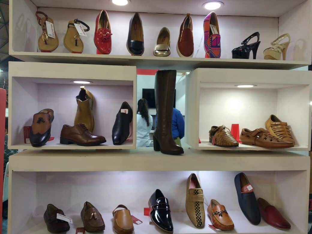
An open display shows the implementations of the tile products more vividly and naturally. It becomes easy to catch the designs and their diversities. You can display the latest products with the slightest detail by that.
It would naturally leave an extensive space in front of the display. There is the option to decorate that place differently with furniture, flowers, and showpieces daily.
Add a separate corner
The more knowledge a person gains about a product, the more they are into it, especially if they have a prior interest. The business owner can construct a separate corner where there will be samples of different tiles from different corners of the world with descriptions.
Besides that, or as an ideal alternative, there can be digital screens at the corners of the ceiling as an information library.
Last Words
People like beauty, and everyone has their own taste. But to attract them, only countable strategies are enough that have been proven successful for over centuries. One just has to relate them with the age and trends.
Strategies in the design of your tile display showroom indicate the same. Hope you liked the ideas discussed. So, why not try them for once?


