Table of Contents
Creation Rules
In the process of developing design, packaging and labels are based on the most current trends, designed to simplify the perception of the product by the audience. However, it is important not only to take into account fashion trends, but also to use fundamental knowledge, such as the theory of the golden ratio, Fibonacci sequences, etc.
Ideally, the product should be noticeable, beautiful, and contain enough information on it. When preparing the design, it is worth focusing on the following characteristics of the packaging:
Aesthetics, attractiveness.
Ideally, even a very small rectangular label will show the customer the best qualities of the product. Remember that aesthetics are often the main reason for choosing a particular brand. This means that the product must be attractive to all representatives of the target audience.
Form style.
When designing labels, the style of the manufacturing company is taken into account. If it doesn’t exist, you need to start by creating a logo and choosing corporate colors – they will be used in black mailer boxes. You can create a brand logo on your own through specialized online services or with the help of specialists.
A uniform corporate identity in packaging and label design helps maintain the company’s reputation and helps consumers remember the company.
Emotional response.
The packaging should have a nice appearance and provide the customer with a pleasant tactile sensation, then a subconscious connection between the brand and positive emotions will be created in a person. Even a bottle of detergent, a pack of cereals, and a box of smartphones can generate the same positive response and customer loyalty.
7 unusual label design ideas
1. Shape-shifting label.
Designers from Italy have created such a label for the elite wine “Barolo Balena”, seeking to draw the consumer’s attention to nature and the changes constantly taking place in it. The sticker is made in the shape of a whale, with a skeleton on the front and a gold-plated whale’s tail on the back. This part of the label folds back and can be attached to the top of the bottle, resulting in a volumetric composition.
2. A label that allows you to speak up.
On the wine label, the designer left a space for notes to allow anyone who wants to leave their thoughts on it.
3. In the form of a menu.
This packaging and label design option was created for Spanish wines that match a variety of snacks. It is this feature of the drink that led to the fact that the producers decided to use the design with the menu card.
4. Unusual style of inscriptions.
This technique was used by a designer from the United States, deciding to combine the features of Chinese calligraphy and the rules for reading manuscripts, that is, reading from top to bottom and from right to left.
5. Emphasis on production technology.
This is how Filireagi bottles of Greek homemade wine are decorated – they show the stages of the drink production from grape harvest to bottling.
6. Intersecting lanes.
This original label was created for Canadian beer – it looks like an interweaving of colorful stripes with calligraphic inscriptions. Thus, the designer wanted to say about the mixing of English and French culture in the city of Quebec.
7. Braille.
This is how the bottles of Spanish wine “La Rioja” are decorated. The fact is that the product of this company has the brightest taste.
Stages of packaging and label design development
Before tackling the actual packaging or label design, it is important to familiarize yourself with the product. Namely: it is necessary to understand the consumer’s motivation for buying, the way, the place of the product use, the competitive environment. The latter presupposes taking into account the design and strategy of competitors.
Further important:
- Find a unique creative solution. To do this, select the main color and image codes, assert the advantages of the product, describe the marketing brands of the packaging.
- Prepare an image line, draw / photograph food zones, create characters, form a design concept in a graphic editor. The latter should present the product as the buyer sees it on the counter or on the Internet. For each concept, at least five options for different types of packaging design are prepared to create a basic design. All sketches are provided ready-made for easy understanding, and not as a sketch.
- The approved version is completed based on the wishes of the customer.
It is important, already in the process of working on the design, to understand exactly how the packaging and the label will be made. That is, it is necessary to develop a form factor (for cardboard, plastic, PET, glass), the design of the molds.
The approved basic design is made up for the entire form of packaging, after which it is prepared for production, taking into account the technical requirements of the manufacturer.
Packaging and label design testing
Beautiful packaging is not always really effective. First of all, the design should promote the brand idea and motivate the audience to trust the manufacturer and purchase the product.
It is important to use product packaging as an effective marketing material. Independent testing, in-depth interviews, polls and hall tests can achieve this result.
The research objectives always depend on the specific situation. However, testing will not provide the necessary information if the task is set incorrectly. It is important to initially understand what questions require answers. Further, an individual algorithm is prepared and agreed with the customer in writing.
Types of packages for milk
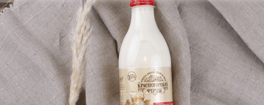
Modern manufacturers produce very different packages for milk, so it is not surprising that customers can look at them for a long time, re-read and choose something to their liking. Milk containers are now made of paper, cardboard, foil and aluminum, glass, plastic, tin, and laminated film.
Of course, manufacturers take care of maintaining the quality and useful properties of the product supplied to the market. How can this be achieved? You should know everything about the types and properties of both packaging products and dairy products, and understand which product should be packed in which container. The following three types of packaging are most commonly used for milk and dairy products:
- Soft packaging (polypack). This is a polyethylene package for milk and it is perhaps the most versatile of all, light in weight and is a high-strength polyethylene bag. Usually, almost all types of dairy products are poured into such containers. The only bad thing is that such bags do not hold their shape after opening, but this is solved with the help of stylish reusable jugs, in which the bag is placed.
- Semi-rigid packaging (containers made of polyethylene terephthalate, polystyrene, polypropylene and other thermoplastics). This type of packaging differs from plastic bags in its rigidity of shape (this is a big plus), and has a reliably closing lid, a layer of foil or film. Usually sour cream, fermented baked milk, yogurt, cottage cheese and other fermented milk products are sold in such packaging. Containers made of semi-rigid materials are strong enough, keep their shape, are not afraid of blows.
- Semi-rigid packaging made of sheet and combined materials (tetra-pack, tetra-brick, pure-pack, elopak, etc.). Has everyone seen milk in cardboard boxes on the shelves? We are talking here about just such a package. It is lightweight, durable, has a compact shape, does not let in light, and this increases the shelf life of products.


