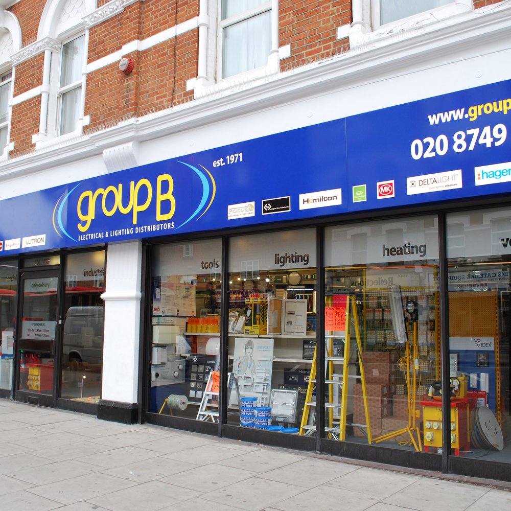
A flawless marketing and branding strategy is essential for establishing a new company and growing it to new heights.
Your business can have a wider market reach and draw in plenty of customers through the use of innovative signage ideas.
With that in mind, Shieldcoart Business Signs has prepared a set of helpful tips when creating your business signs:
Creative Exterior Signage
Sign Visibility
- Making consumers aware of the focus of your good or service is the goal of using business signs.
- Any customer will only read the signs for 3.5 to 5 secs at most.
- Creating the best eye-catching strategy will help you draw in more interest and explain your goods to prospective clients.
- According to the rule of thumb, the fonts must be at least one foot tall for every 10 meters of distance.
- Higher signage visibility can be achieved by a clear and legible representation of your company.
Signage’s Ability to Be Read
- Increase the size and readability of the content.
- A terrific sign manages white space effectively, incorporates minimal content, and uses graphics with strong contrasts.
- When putting up outdoor signage, take into account the average speed of traffic of 20, 40, and 50 miles per hour.
- Determine the size at which the information should be displayed so that rapidly moving traffic can see and take in what is written on the signs.
- Avoiding “clutter” is a key element when designing successful signage because it intentionally has a larger effect on signage.
What Conceals the Signage?
- What’s the point of investing large sums of money on banner hoardings if they will only be hidden beneath electric cables or flashing lights?
- The goal of creating banner ads is to evoke an excellent customer reaction.
- The visibility of your banner advertisements must always be amplified and straightforward.
- Put the banner signage in prominent locations and ensure that all of the listed elements of the banner ads, have a spacious area, and are clearly visible.
Design of the Signage
Sizes Should Be Scaled
- The most difficult aspect of designing signage is determining the correct size and scaling it accordingly.
- It would be easier to choose the right size to work on if you consider the position where the signs will be placed, such as the doorway, the parking area, or a rental board.
- The reach of the sign would be greater if the size is also larger! This is because it simplifies the signage’s legibility and is certain to bring in a variety of potential clients.
- An efficient method for enlarging letters for greater visibility is “Power Kerning”.
- The naked eye is an excellent tool for spotting flaws, and when a letter is hidden from view by excessive styling or when there’s ineffective spacing, it certainly sees that.
- Perfect proportions, the right scale, and exact letter spacing spring up as essential elements of an iconic design.
What Color Draws the Customer’s Attention?
- Colors have power! Intentionally planning the color of the sign is an important factor in developing beautiful signage.
- Colors are perceived by the eyes first, and they have a significant impact on carrying your brand image.
- According to studies, colors account for approximately 80% of brand awareness; gradually, it leads to your brand’s signature!
- The best choice has always been lighter letter colors against a darker background.
- However, one thing to keep in mind is that the letters should not appear sleazy against the backdrop.
- Picking trendy lively and vibrant colors draws a lot more interest from the public.
- Fewer colors are better — the perfect color game includes a dominant color with appropriate contrasts and highlights toward a lighter shade.
Best Tips for Sign Fonts for Better Readability in a Distance
- Fonts, like the phrases on your signage, can carry weight!
- Deciding on the appropriate font style is crucial as it holds the key to successfully marketing your business.
- Good fonts are easy to read; the eye interprets quicker when the font chosen complements the graphics and color palette.
- Exterior fonts must be definitely readable regardless of whether the customer views them from a relatively long distance.
- Bad fonts with excessive styling would blend into the surrounding background and would create a cluttered look.
- Massive fonts could blend together and end up losing their real shape, and obstruct the whole visibility of the sign.
- It is mostly believed that writing all letters of the signage in capital letters would increase the sign’s visibility.
- However, using them stresses the eye and makes reading it complicated.
- Sans Serif, Serif, and Helvetica are the fonts that are most commonly used in the layout of a sign.
Conclusion
Every business owner’s wish is for their business to gather more awareness. That is why most companies spend a fortune on ads that improve branding and identity.
If you are looking for ways to improve your business, the ideas mentioned above by Shieldcoart business signs may come in handy. If you are intending to establish a company, utilizing these signage ideas will help you get there.


