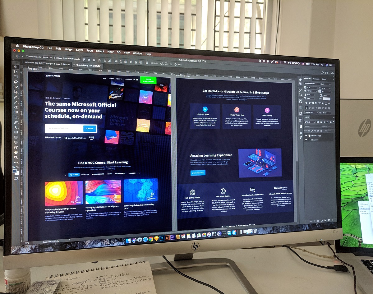
Creating a website design requires not only certain creative skills from a web designer, but also a clear understanding that the result of their work is a website, and not a screenshot that is useful only for a portfolio.
Therefore, the development of website design is a kind of technological process that is recommended to be observed.
So, let’s begin:
Table of Contents
First think, then do
A good recommendation not only for designers, but for all people, which saves a lot of time, effort and nerves. But if we are talking about the artistic design of the site, then before you start work, think carefully about the goals, objectives, ideas of the web page. It is best to take a simple pencil, a blank sheet of paper and draw a rough version of the site with all the images, an indicative grid and the location of the elements. And only after that you should start working at the computer. A draft will help you find the most interesting website design solutions;
Move from the largest to the smallest, and from the general to the particular. This recommendation really helps to create good web pages. After all, at first it is better to draw several sketches of the site in general and supplement them with some bright, small details, original widgets (widgets are elements of the page interface), moving various blocks, etc.;
Use a modular grid, or so-called page layout. It simplifies not only the creation of a web resource interface, but also facilitates its layout. Therefore, when setting a modular grid, be sure to stick to it;
Apply scaling, which allows you to create sites that scale to multiple monitor resolutions. To do this, you need to find the minimum and maximum width of the site;
Consider growth
Over time, any site can grow, that is, increase the number of pages and sections, and, ideally, navigation should not be revised, so give preference to text navigation;
No more than three fonts
Use no more than three fonts in page design, and also draw up a plan for paragraph sizes, indents and indents;
Reflection on the user. The designer must “see” how the page elements will behave when the user navigates;
Organize content the right way
The content of a web resource depends on its task, so the answer to the question of how to format content correctly will always sound different. But still, in the design it is necessary to use paragraphs, quotes, links, numbered and unnumbered lists, tables, columns, etc.
The above recommendations are not mandatory, because design is a creative process, but you should neglect them only if you are sure that you know how to do better, but not worse.
But still, the main thing in website design is the concept. Therefore, it is up to you to decide how the site will be – unique, harmonious or creative.
- How to create when the muse has left
It happens that creative people have a crisis of inspiration and ideas. Web designers are no exception. You need to know the rules and recommendations on the topic “how to design a website”, but where to look for inspiration, if at least crack, but there are no new ideas in your head. Here are some tips from world-renowned web designers:
Travel
Travel and more travel to different parts of our planet. This activity brings not only a lot of emotions, impressions, but also ideas. It is clear that not all designers have the opportunity to jump on a plane at any time and fly to another country in the world, but, for example, to go or go to the nearest forest is not a small trip that everyone can do;
- Look for inspiration in your notebooks, drafts, or long-forgotten work. And also look at some old items, for example, the cover of your favorite book, worn to holes, old design magazines, etc .;
- Listen to music. It helps to return not only creative enthusiasm, but also not to be distracted by extraneous things;
- A lot of reading various literature and at the same time making notes, sketches in the form of opinions, points of view, details, some elements;
- Take a shower and clean up the house, garage, apartment;
- Run around the park, ride a bike, walk the dog, but just don’t sit at the computer and think about the project;
- Exchange thoughts and opinions with colleagues;
- Observe the most banal and ordinary things in the office, at home, on the street;
- Do not look for ideas in Google and Bing.
5 Creativity Myths to Avoid
We draw new ideas
But still, the most common way to scoop up fresh ideas is to study various already created design works. Looking through successful work, you can find new ideas for yourself. But then again, there are rules, following which it is best to look at someone else’s work.
These rules are specific questions that need to be mentally answered:
- why the web designer chose this particular color and not another;
- What is the emphasis on the site?
- how text blocks are created;
- why these fonts are used;
- what effects on the page and why.
The answers to these questions will help you find the right idea or expand your creative boundaries.
How to cope with a lack of ideas: 5 practical tips
Instead of a conclusion
Although professionals do not advise looking for ideas on the Internet, there are still many blogs devoted to design issues, special creative collections for designers, various website design galleries, sites for posting favorite works, photo resources, where looking at the details of an image will take more than one hour , collections of freehand drawings, a resource dedicated to samples of interesting packaging from around the world, sites with a collection of book covers, collections of logos, flyers, and much more.
But the main thing is not to go to extremes and not copy other people’s ideas, but try to develop your imagination, which over time will begin to generate new and interesting design ideas.
High conversions for you!


