


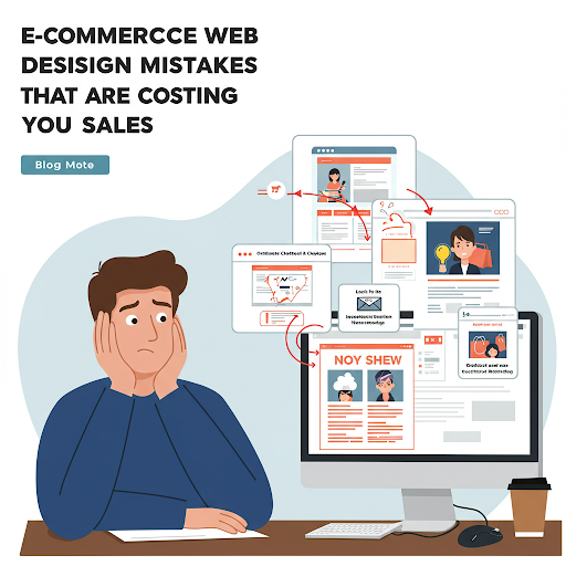
Launching an e-commerce site is a big step, but designing it for success is an entirely different challenge. Even the best products won’t sell if your website turns visitors away with frustrating user experiences or poor design decisions.
In this article, we’ll dive into the most common E‑Commerce Web Design Mistakes that could be costing you sales—and more importantly, how to fix them.
Table of Contents
1. Complicated Navigation
❌ The Mistake:
Confusing menus, hidden categories, and cluttered navigation bars make it difficult for shoppers to find what they need. If users can’t locate products quickly, they’ll bounce.
✅ The Fix:
Use a clean, logical navigation structure.
Add a clearly visible search bar.
Use filters and sorting options for large inventories.
2. Lack of Mobile Optimization
❌ The Mistake:
If your site isn’t mobile-friendly, you’re alienating a massive segment of users. Google also penalizes non-mobile-optimized sites in search rankings.
✅ The Fix:
Use responsive design that adapts to all screen sizes.
Test your website on various devices and browsers.
Prioritize mobile performance and page speed.
3. Slow Loading Times
❌ The Mistake:
A slow website leads to higher bounce rates. Every second of delay after the first 3 seconds can significantly decrease conversions.
✅ The Fix:
Optimize images and videos for the web.
Enable caching and use a content delivery network (CDN).
Minify CSS, JavaScript, and HTML.
4. Poor Product Pages
❌ The Mistake:
Weak product descriptions, low-quality images, and missing information create distrust and prevent users from clicking “Add to Cart.”
✅ The Fix:
Use high-resolution images with zoom functionality.
Write detailed, benefit-focused product descriptions.
Include specs, sizing guides, FAQs, and reviews.
5. No Clear Call-to-Action (CTA)
❌ The Mistake:
If customers don’t know what to do next, they’ll likely leave. CTAs that are hidden, unclear, or overly aggressive kill conversions.
✅ The Fix:
Use bold, contrasting buttons with clear wording like “Buy Now” or “Add to Cart.”
Place CTAs above the fold and at key scroll points.
Make sure each page has one primary goal and CTA.
6. Complicated Checkout Process
❌ The Mistake:
Too many steps, forced account creation, or lack of payment options are major cart abandonment triggers.
✅ The Fix:
Offer guest checkout.
Minimize form fields and steps (ideally under 5 clicks to complete).
Accept multiple payment methods (credit cards, wallets, BNPL, etc.).
7. Lack of Trust Signals
❌ The Mistake:
If your site doesn’t look credible, users won’t feel comfortable making a purchase.
✅ The Fix:
Display security badges and SSL certificates.
Highlight customer reviews and testimonials.
Include clear return policies, contact info, and an “About Us” page.
8. Inconsistent Branding
❌ The Mistake:
Mismatched fonts, clashing colors, and inconsistent tone make your store look unprofessional and confuse visitors.
✅ The Fix:
Use consistent typography and color schemes.
Align your visuals with your brand identity.
Create brand guidelines and apply them across your site.
9. No Live Chat or Support Options
❌ The Mistake:
When customers have questions but can’t reach you, you lose the sale.
✅ The Fix:
Add live chat or chatbot functionality.
Offer multiple support channels (email, phone, social media).
Ensure your help center or FAQ section is easy to find.
10. Ignoring SEO Fundamentals
❌ The Mistake:
A beautiful site is useless if no one finds it. Skipping SEO best practices means you’re missing out on valuable organic traffic. E‑Commerce Web Design Mistakes
✅ The Fix:
Optimize product pages with relevant keywords.
Use SEO-friendly URLs, titles, and meta descriptions.
Submit your sitemap to Google Search Console.
11. Pop-Up Overload
❌ The Mistake:
Excessive pop-ups and modal windows can annoy users and increase bounce rates—especially on mobile.
✅ The Fix:
Use pop-ups sparingly and strategically (e.g., exit intent, scroll trigger).
Ensure pop-ups are easy to close and mobile-friendly.
A/B test pop-up performance before going live.
12. Neglecting Site Search Functionality
❌ The Mistake:
Poor search functionality frustrates users who are ready to buy but can’t find specific products.
✅ The Fix:
Implement advanced site search with autocomplete and filtering.
Ensure the search handles misspellings or partial keywords.
Display results with thumbnails and pricing.
13. Lack of Social Proof
❌ The Mistake:
No one wants to be the first to buy. Without reviews, testimonials, or customer photos, shoppers lack confidence in your products.
✅ The Fix:
Enable customer reviews on product pages.
Feature user-generated content from social media.
Showcase trust-building stats like “10,000+ happy customers.”
Conclusion
Your e-commerce website is your digital storefront—and just like a physical store, it must be welcoming, easy to navigate, and designed to build trust. By avoiding these common web design mistakes and focusing on usability, performance, and customer experience, you can dramatically increase conversions and sales.
If your online store isn’t performing as expected, go through this checklist and identify areas to improve. Fixing even a few of these design flaws can lead to significant improvements in engagement, trust, and revenue.
Read More = E‑Commerce Web Design Mistakes