


Here’s the truth nobody tells you when you launch an online store: your product photos are doing the selling for you. And when most of your shoppers are scrolling through your store on a tiny screen while half-watching TV, that visual storytelling becomes everything. This is where a well-chosen phone mockup stops being a design luxury and starts being a conversion tool.
E-commerce brands that master mobile presentation aren’t just making things look pretty — they’re reducing bounce rates, building trust, and making it embarrassingly easy for customers to say yes.
Table of Contents
Why Mobile Context Changes Everything
Think about the last time you bought something online from your phone. You didn’t see a sterile white-background product shot and feel inspired — you saw something that looked like it belonged in your life. That’s the emotional gap that contextual mobile visuals close.
When shoppers see your app interface, your checkout flow, or your product gallery rendered inside a sleek, photorealistic device frame, something clicks psychologically. It validates that the experience was designed with them in mind. It answers the unspoken question: “Will this work for me, on my device, in my world?”
The result? Higher engagement, lower abandonment, and customers who feel confident enough to tap “Buy Now.”
What Makes a Phone Mockup Actually Convert
Not all mockups are created equal. A blurry, low-res device frame slapped around your app screenshot can do more harm than good — it signals low effort, and shoppers notice. For a phone mockup to genuinely move the needle, it needs to hit a few non-negotiables:
- Photorealistic rendering that makes the screen look like it’s actually turned on — with proper reflections, depth, and screen glow
- Accurate device proportions so your UI doesn’t look stretched or distorted
- Flexible angles and orientations to let you present different user flows — browsing, cart, checkout, confirmation
- Clean, uncluttered compositions that put your product experience front and center
- Fast customization, because you have a launch deadline and 47 other things on your to-do list
When these elements align, the mockup disappears into the background and the experience takes over. That invisibility is exactly the goal.
Real Examples: Phone Mockups in Action
Let’s get concrete. Here’s how smart e-commerce teams are actually using device visuals to shape buyer decisions.
Fashion & Apparel brands use phone mockups on their homepage hero sections to show their mobile lookbook in action. Instead of a static model shot, visitors see a hand holding a device displaying a curated outfit grid — instantly communicating that the mobile shopping experience is polished and easy to navigate.
Food Delivery & Grocery apps embed mockups in their app store preview images and landing pages. A top-down flat-lay showing a phone screen mid-checkout — surrounded by fresh ingredients — is worth ten bullet points about “seamless ordering.”
SaaS E-commerce Tools use multi-angle mockups in their pitch decks and investor pages to show their dashboard across iPhone and Android simultaneously. It builds credibility fast: if the UI looks this good in a mockup, the real thing must be solid.
DTC (Direct-to-Consumer) brands launching on mobile-first channels like TikTok Shop use phone mockups for video thumbnails and paid social creative. A crisp device frame around your product page screenshot performs dramatically better in ad feeds than raw screenshots alone.
The consistent thread? In every use case, the mockup isn’t the point — the experience inside it is. The device frame just makes the experience believable.
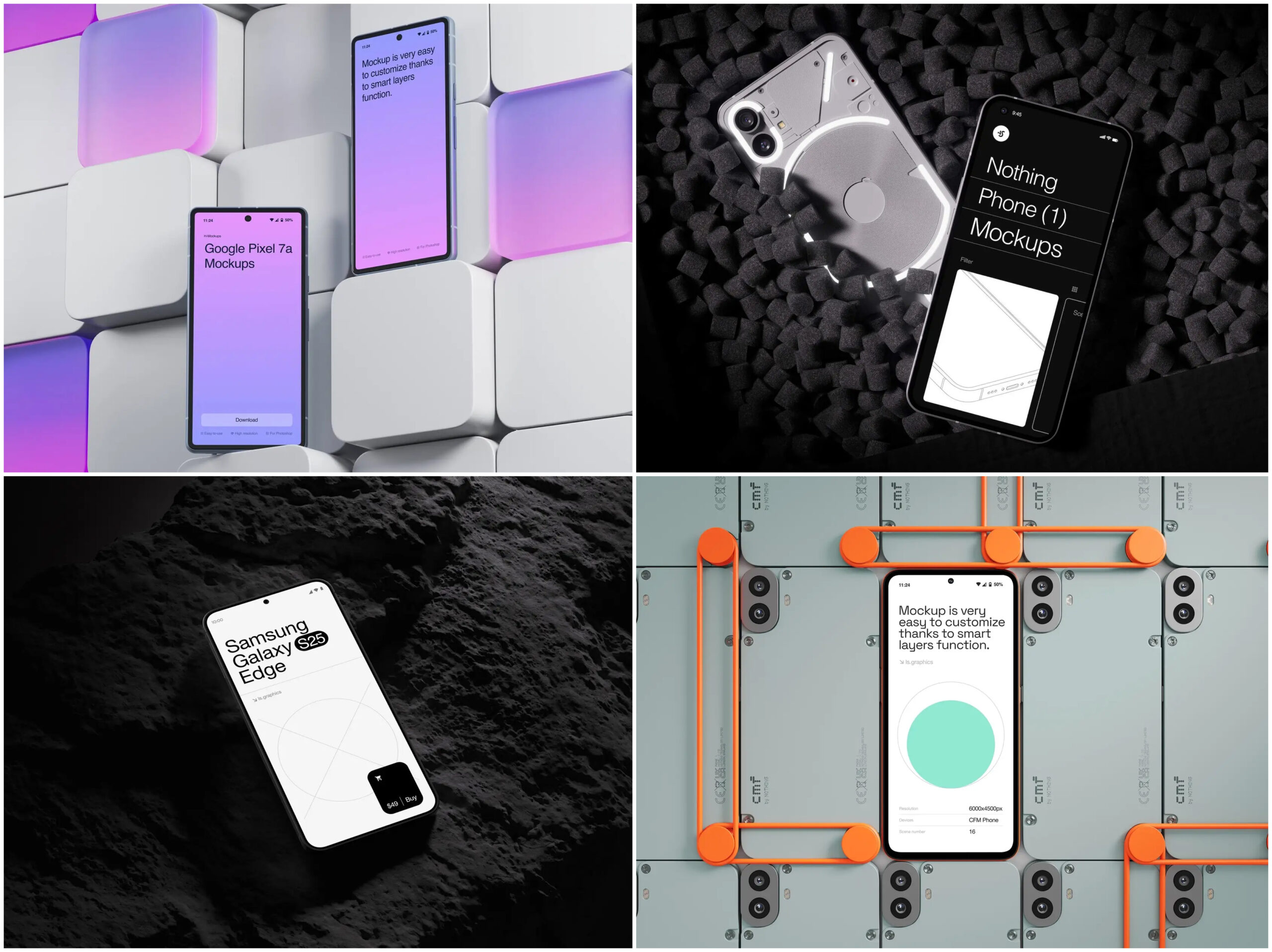
Premium Mockups That Do the Heavy Lifting
If you want mockups that look like they came out of an Apple keynote rather than a free template site, ls.graphics deserves a serious look.
The rendering is ultra-realistic — reflections catch light the way actual glass does, shadows have proper depth, and device materials look tactile rather than flat. Layers are named and grouped so swapping in your screenshot takes seconds, not minutes.
The angle variety gives real flexibility:
- Front-facing for app store listings and ad creatives
- Perspective shots for hero banners and landing pages
- Hand-held scenes for lifestyle contexts that feel authentic
Color styles range from clean whites to dramatic darks, fitting any brand identity. The aesthetic leans toward stylish minimalism — breathing room, intentional negative space, nothing competing with your product.
For teams that value their time as much as their visual output, this level of polish straight out of the box is genuinely rare.
Conclusion: Presentation Is Part of the Product
In mobile e-commerce, the gap between a good product and a product that sells is often just presentation. Shoppers can’t touch your fabric, smell your candle, or taste your sauce before they buy. What they can do is look — and what they see in those first few seconds shapes everything.
A thoughtfully chosen phone mockup bridges that gap. It takes your mobile experience from “screenshots on a white page” to “this brand clearly knows what it’s doing.” That’s not a small thing. That’s the difference between a scroll-past and a sale.
Whether you’re launching your first mobile storefront or refreshing an established brand’s visual language, investing in high-quality device presentation pays off. Libraries like ls.graphics exist precisely for this: to give you professional-grade visuals without the professional-grade production timeline. Use them well, and your mobile shopping experience won’t just look great — it will convert.