With the advent of new technologies, the financial services sector has undergone a radical transformation over the past decade. In an effort to boost productivity and revenue, business leaders have turned to IT for help.
On the other hand, it is working to make its services more user-friendly by modernizing its aging infrastructure. The banking industry was slow to adopt new technologies, which was a big problem. Even though the world changes quickly, it has been able to change to meet people’s needs.
The financial technology industry works toward making financial services more accessible and user-friendly. Fintech user experience (UX) is no different from any other industry in terms of the features that are essential to ensuring the safety and satisfaction of its customers.
In this article, we will provide a comprehensive overview of the most important design considerations for fintech products, as the design must meet user expectations for experience and usability.
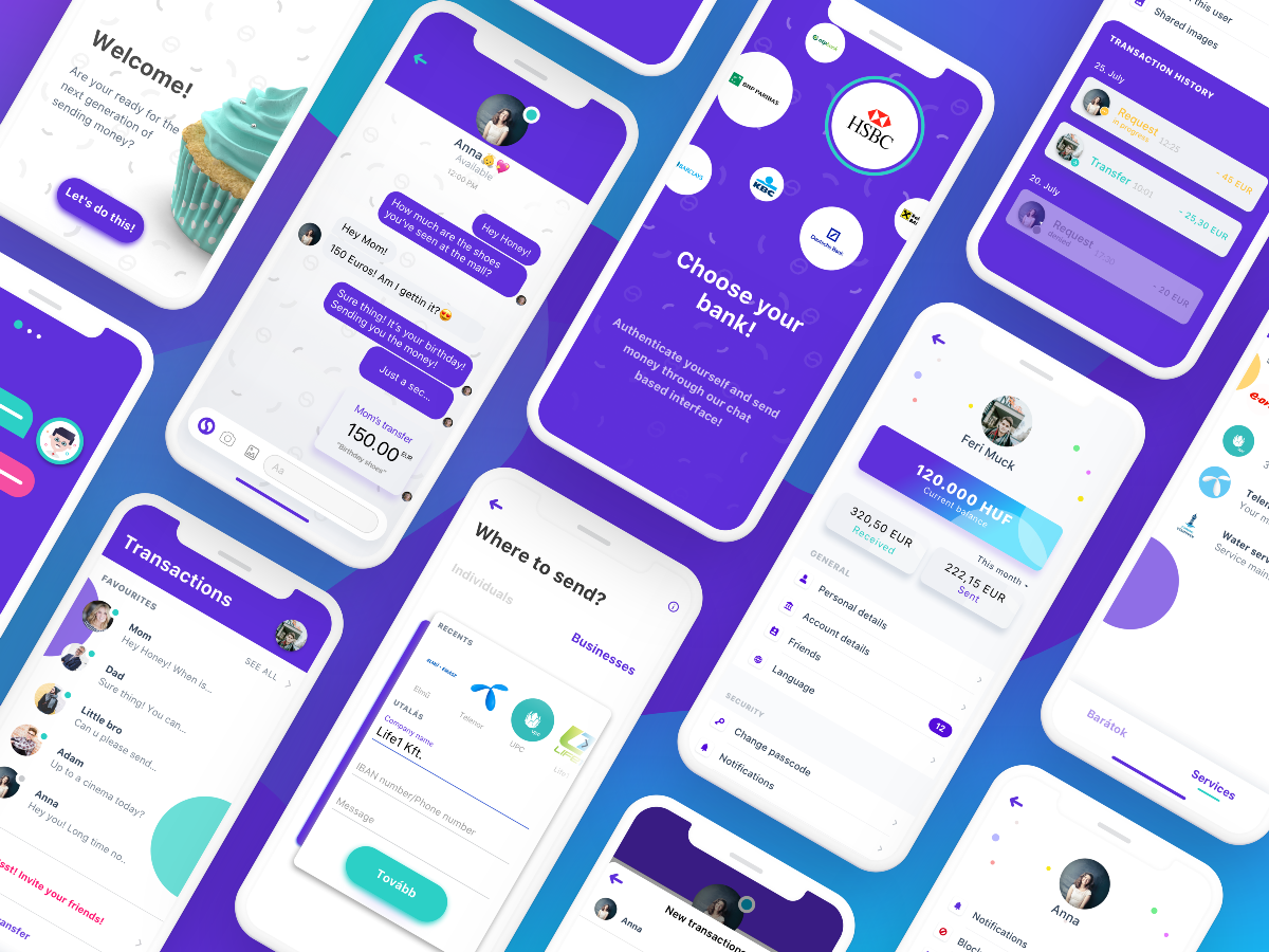
If you are interested, check this case study, “Finany,” created by Musemind design agency. This will give you a better understanding of how fintech apps enhance people’s lives.
Table of Contents
Trusted Process
When it comes to money, people want to be sure they can trust whoever is handling them. Trust and confidence are important for making a product that works well, lasts long, is fair, and meets user expectations. But trust and confidence can’t be written into a technical or design brief.
Instead, following the law should be done without the help of regulatory authorities. Some of the most important security measures are biometric and two-factor authentication, multi-step approvals for important transactions, and encrypted data storage.
For example, a foolproof identification and authorization system for high-value transactions would give people a sense of security. When there are more steps of authentication, the user knows that their identity is being checked and that they are being asked for permission before a big transaction is made.
In finance, you want your brand to communicate confidence, security, and esteem. It doesn’t matter if you’re a bank, a payment system, a personal finance tool, or an advisory firm; money is the one thing that brings them all together. You want to convey not only wealth and status, but also empathy and loyalty to those around you.
Data Visualization
Most people wouldn’t say that managing money is one of their favorite things to do, and for good reason. Learning how to handle your money can be a lot of work if you don’t know much about money and don’t have the right tools. And when you think about how important it is to plan for your financial future, it can add to the stress of managing your money and make the task seem impossible.
Finance is already hard to understand and scary. Users shouldn’t be afraid to use an app that has power over their money. So, beauty is most definitely important. In this case, “aesthetics” doesn’t mean bare-bones minimalism, but rather nice-looking parts that add to the design and make the user happy.
Personal Touch
Personalization is one strategy for gaining customer loyalty. Customers would appreciate the ability to customize the software to their specifications. You can, for instance, permit them to modify the dashboard’s most-used features, create templates, or alter the visual theme.
In addition, AI technology will simplify the subsequent procedure and make customers’ lives easier. Software Powered by AI will evaluate how clients use the app and how it can be enhanced to meet their specific needs.
Acorns is a prime example of how effective personalized tools can be. It is one of the most widely used financial technology applications among millennials. Acorns is able to incentivize users to take action and foster long-term user retention by utilizing a simple prediction algorithm to forecast each user’s future investment potential. This encourages users to stick around to watch their money grow, which in turn fosters long-term user retention.
Aesthetics that inspire loyalty
The principles of emotional design are applicable across industries, including finance. Often, aesthetic design elements that enhance functionality are perceived as unique selling propositions (USPs) and inspire user loyalty. With aesthetically pleasing designs and small details, you can stand out from the crowd.
For example, you can implement animations. Using animation to make a smooth transition between interface elements helps with product management. You can use functional animation to display requested data as graphs and charts, as well as inform the user of the outcome of the action they just performed.
Furthermore, vivid graphics and illustrations improve the experience, which is critical for making a dry subject like investing more interesting. This is especially difficult for an investing app because the content must not only be easily accessible and understandable, but the app must also actively encourage usage.
Choose the right color
According to studies, 60% of people decide whether they are interested in a product or message based solely on its color. Color palettes are more than mere visuals; they also represent specific types of data. Choosing a robust color scheme assists in laying the groundwork for the use of visuals to illustrate various investment strategies.
By associating colors with objectives and measurable financial goals, users can comprehend and visualize the expected outcome of their investment.
Hurlbert and Ling discovered that participants of both sexes react more quickly to blue color contrasts. Other colors that can be included in a UX designer’s color palette are purple, which symbolizes wealth and harmony, and black, which is associated with sophistication and style. Black is also a highly versatile color that is frequently combined with white.
Effective UX writing
The most common mistake in the finance industry is to overload the user with information.
Some users may be inexperienced with fintech technology. As a result, such customers are likely to be turned off by the abundance of jargon and non-actionable data.
The solution is straightforward: build a fintech company that uses simplicity and user-friendliness as a differentiator.This will not only attract a larger market segment, but it will also position the company for long-term growth.
Each user is unique, and the vast majority will have unique opinions regarding how to utilize fintech. That’s why In addition to shapes and colors, microcopies serve as guides for particular processes and are an essential component of an effective design.
Wrapping up
What makes any design unique is the eye for small details. And what makes a design successful is when it bridges the gap between the organization’s commercial objectives and the available development resources. Moreover, any design employed by the company must be able to adapt to the ever-changing business objectives. Those companies that want to develop the next major fintech application must consider how the final product will adapt to future changes.


